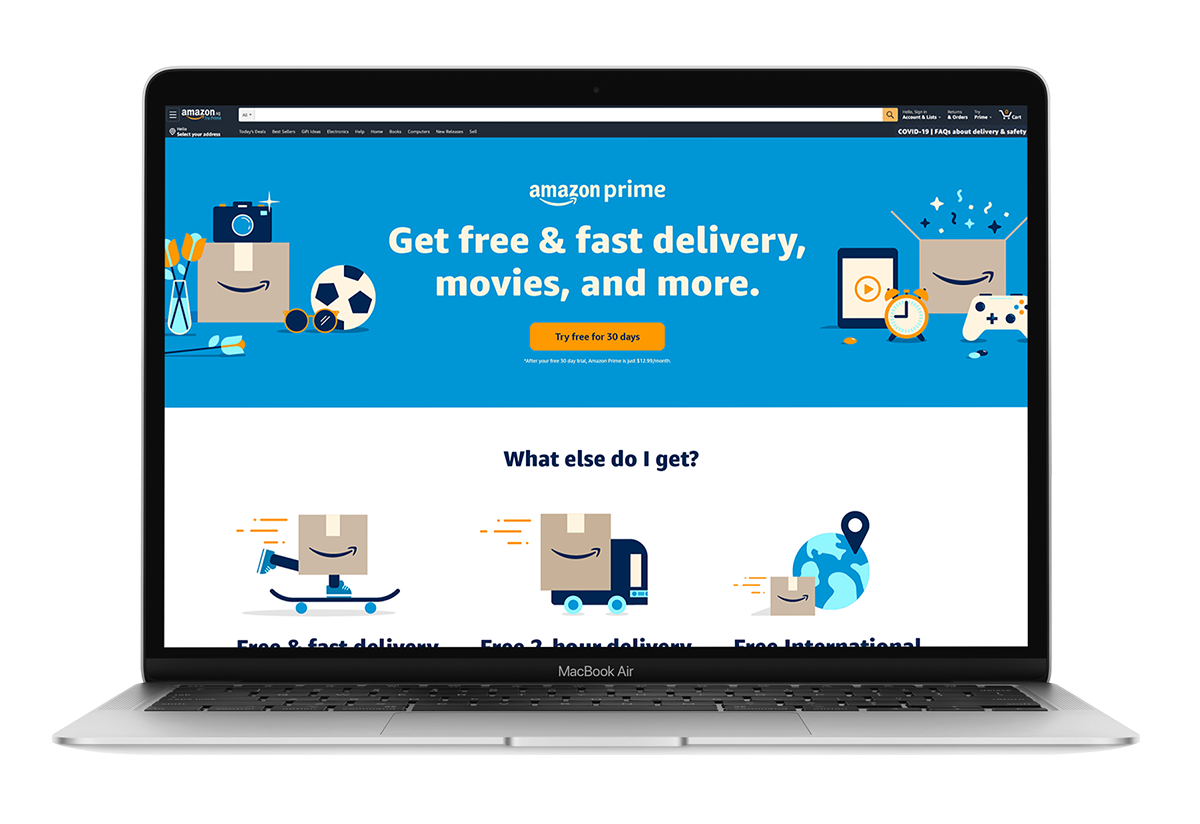
CLIENT: Amazon Prime Expansions
PROJECT: Redesign of the /Prime page and Gateway header image and assets for new launches in Emerging Markets
MY ROLE: Digital Product Designer for the Prime Expansions Cross-channel Product Team
PARTNERS: UX/UI Manager, Product Managers, UX Copy Writers & Engineers
UX/UI Manager: Rafael Soriano
Partner Product Designer: Stephen Oh
Product Manager: Cathy Synowiec
DATE: Created mostly during Quarantine 2020, began in March 2020
TOOLS USED: Illustrator & Photoshop
CHALLENGE: The initial real challenge was starting on the team just 3 days before the Covid lockdown happened, but we all made it work. With launch dates for new locales pushed back a few months because of Covid, we were able to have a 3 month window that we didn’t have before to redesign the look and feel of what launches in new markets would look like. Among the series of assets to redesign, I started with the /Prime page which is the page that explains what benefits you get as a Prime member. I also redesigned the Gateway image for the initial Amazon Prime homepage. I also focused a lot on making sure that everything was accessible as it was not before.
SOLUTION: I spent the initial research portion just researching and understanding the Prime brand as it was currently and how it needed to move forward. I then spent a lot of time researching all of the Amazon Prime pages including functionality, image sizes, placements, etc. I began working by prototyping a few versions of how I wanted to layout the UX flow. We focused on the emerging markets side of things with the intent of shifting the US side to a similar model. I worked on the UX side as the illustration style was already established by Fuzzco and completed by the Prime team. I do still have to build out some illustrations for random things and for localization which is great because I really enjoy that side of things too. I designed everything with the intent of having small winks of localization throughout the illustrations on the page. The order in which the different benefits show up in different locales as well, depending what they want to focus more on.
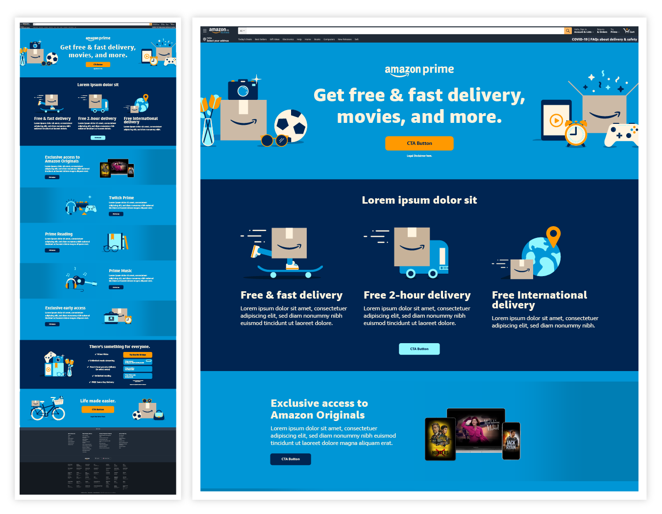
A FEW NOTES: The Apples to Apples version is the direction we ended up going with. This was a 1-to-1 update that required less lift on the engineering side of things. Although the desktop version existed, the mobile version did not - so that was a net new design and process. The Light & Dark versions were the “Pie in the Sky” ideas which would have required a redesign from the ground up for both desktop and mobile.
A FEW MORE NOTES: As of October 2020, nothing is finalized yet. Coming soon!
/Prime Page Redesign - apples to apples version Desktop
/Prime Page Redesign - apples to apples version mobile
/Prime Page Redesign - Light version INITIAL WIREFRAMES
/Prime Page Redesign - Light version Desktop
/Prime Page Redesign - Light version MOBILE
/Prime Page Redesign - dark version INITIAL WIREFRAME
/Prime Page Redesign - DARK version Desktop
/Prime Page Redesign - DARK version mobile


